Trade Shows, Displays, Signage & Storefront
BRANDING FOR B2B & CONSUMER EXPERIENCES
Art Direction // Branding // Print

Overview
Tivoli Audio products stand out in the crowded consumer electronics space due to their unique style and design but need displays, signage, and trade show booth options to elevate the brand and inform. Throughout my time there, I directed and worked on many projects for updated and improved b2b and b2c experiences which aligned with the brand’s design system.
Trade Show Booth
A unique multifunctional space
Tivoli Audio required a flexible and dynamic space when attending High End Munich in 2018. Working with a German company, Innovatio Design Solutions, we created a versatile show booth with public space, a private meeting area, a listening room, a coffee bar, and storage.
At least one of each product on display was connected to the same audio source for playback through cables in the subfloor and each product line was given a zone to help differentiate their capabilities. The construction was built and furniture was selected to be dismantled to save time and money for future trade shows and the visible walls were constructed with fabric to be easily and economically updated and replaced.


Trade Show & Store Signage
Clearly conveying product features
Tradeshow signs: Designed and produced signage to illustrate product capabilities through simple words and icons to communicate with an international audience. These signs were mounted on easel-backed foam core making them collapsible, lightweight, and easy to transport.
Store signs: Designed with key product features and local currency pricing in standard frame size formats. These signs were published to the brand’s online asset portal for easy downloading and printing by the dealer. Each sign was translated and published in localized languages when necessary to ensure international usabilitiy.


Product Displays
Standing out in stores
With the expansion of Tivoli Audio into multiple product lines and each dealer picking which products to carry, it was necessary to offer different in-store display options that reflected the company’s style.
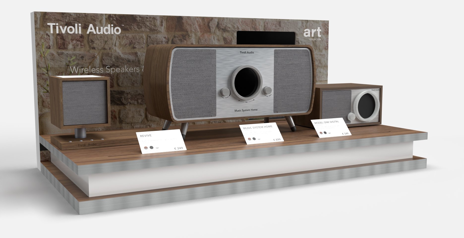
Classic & Art displays: With most dealers opting to carry these two product lines, we designed one display to work with both. The backing can integrate a small LED screen for product and brand information videos about the ART line or the space can be covered. The backing graphic is printed on magnetic material so is easily swappable. The movable and switchable product cards adjust to reflect product availability. The use of the same display for two product lines allowed us to increase the purchase order and lower the per-unit cost for the company and its distributors.
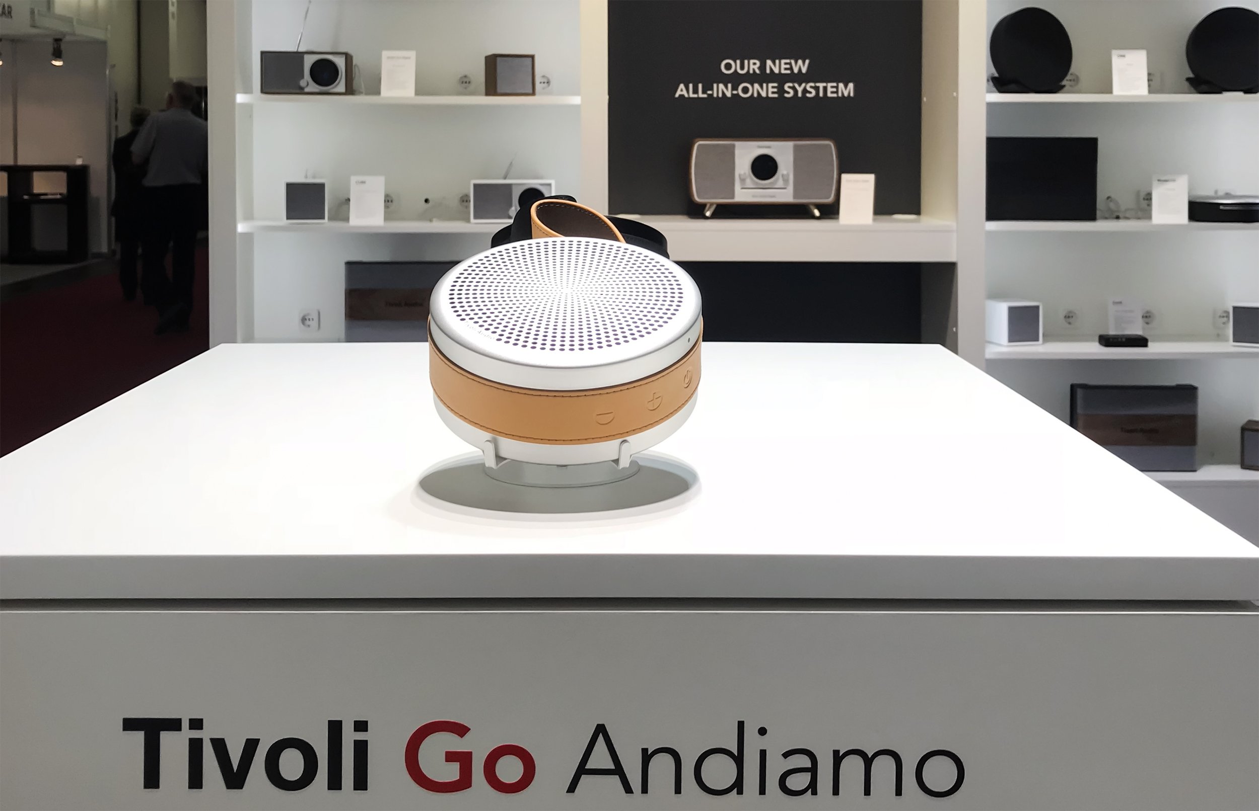
Tivoli Go display: The more modern and compact Tivoli Go product line needed an updated display to help the products stand out. The play button allows music to be heard from the speaker and the earbud stand can be removed to show both speaker colors.
Individual product display: Some dealers only opt to carry a single product and this display was designed to work with all of the brand’s most popular products. The back panel and pairing instructions are easily customized to fit each product and local language.
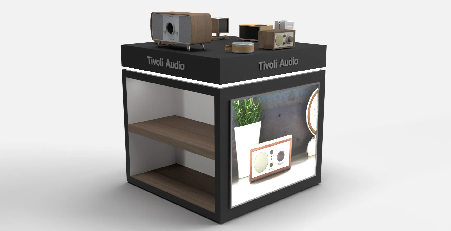
Full product display: This aisle display is designed for a store that carries many Tivoli Audio products. Lifestyle photos, illuminated by a light box, show Tivoli Audio’s popular products to grab the attention of shoppers and the side shelves offer space for inventory to be easily accessible. A centrally located removable panel is located on the top with spaces allowing audio and power supplies to connect to the different displayed products.
Storefront Window Design
Seasonal eye-catching storefront windows
In 2019, Tivoli Audio opened a retail store on the iconic Newbury Street in Boston, MA. To stand out and draw attention to the slightly elevated storefront, I designed fun and bold window graphics using clear static window clings and vinyl. These materials allowed natural light and visibility into the store and did not take up the limited floor space inside. With simple changes to copy, or in some instances, what was hung in addition to the window graphics, these storefront windows remained up for many months.


